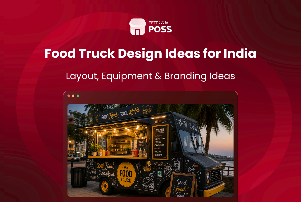
The food trucks we see doing well are rarely the prettiest ones. They are the ones a stranger can read at a glance from the other side of the road.
Good food truck design does three jobs. It says what you sell, it makes the queue comfortable, and it stays inside what your registration certificate allows.
That third one surprises people. A repaint or a full wrap changes a detail recorded on your RC, and the law has something to say about it.
Start with the exterior, because that is what earns the walk-up. The counter, the board and the lighting are what turn that walk-up into an order.
Key Takeaways
- Contrast beats colour. Lettering has to read from across the road, day and night.
- Say what you sell on the panel. A clever name alone makes people walk past.
- A wrap can be changed later. Paint is cheaper to touch up but harder to redo.
- Light the serving window and the menu board, or you lose the evening trade.
- A colour change is recorded on your RC and has to be reported to the RTO.
What Makes a Food Truck Design Work
Every design decision is really about how fast a stranger understands you.
| Design element | The job it does | Common mistake |
|---|---|---|
| Business name | Identity people can repeat | Small, decorative, unreadable at distance |
| What you sell | Turns a glance into a decision | Left off entirely |
| Colour contrast | Keeps text legible from far away | Two mid-tones with nothing between them |
| Menu board | Moves the queue | Too many items, too small a font |
| Lighting | Extends your trading hours | Lit interior, dark board |
| Serving window | Sets where the queue forms | Placed on the traffic side |
A truck parked in a market in Indiranagar competes with signage on every side. The design is not trying to be beautiful there. It is trying to be the clearest thing in a busy frame.
Wrap or Paint Your Food Truck?
This is the first real spend, and both options are valid. The choice depends on how often you expect to change.
| Vinyl wrap | Paint | |
|---|---|---|
| Detail possible | Photographs, gradients, fine artwork | Flat colour, simple shapes, hand lettering |
| Changing it later | Peel and reapply | Repaint the panel |
| Damage repair | Replace one panel section | Colour matching needed |
| Protects the panel | Yes, covers the surface underneath | No, it is the surface |
| Best suited to | Brands that rebrand or run seasonal menus | Simple two-colour schemes, tight budgets |
A wrap costs more at the start. What you buy with that is reversibility, which matters more than owners expect in year one, when the menu is still settling.
Paint earns its place on a simple scheme. If your design is two colours and a name in a strong typeface, paint does that well and touches up cheaply after a scrape.
Whichever you pick, the exterior is a small share of what a truck costs to build. Our food truck setup guide covers where the money actually goes.

Choosing Colours for Your Food Truck
Colour is the question owners ask most, and the answer is less about the shade than the pairing.
Pick your two colours for contrast first, then check you like them. The test is simple: how far away can you still read the name?
| Pairing | Reads at distance | Why |
|---|---|---|
| Dark panel, light lettering | Yes, day and night | Maximum tonal separation |
| Light panel, dark lettering | Yes, best in daylight | Same separation, reversed |
| Two mid-tones (red on brown) | No | Tones merge as light drops |
| Colour on colour, similar weight | No | Nothing for the eye to catch |
Test the pair at the size it will actually be printed. A combination that looks sharp on a laptop can disappear on a panel seen from twenty feet away in daylight.
Keep the palette to three: two strong colours and one accent. That is enough for a vehicle this size, and a short palette makes your cups, uniforms and signage easier to match later.
One practical note. Lighter panels show road grime faster on Indian highways and after a monsoon week. A mid-to-dark base with light lettering is usually the lower-maintenance choice.
Typography Choices That Keep a Food Truck Readable
Type does more work than colour on a moving vehicle, and it is the cheapest thing to get right.
Four rules cover most of it:
- Pick a heavy weight for the name. Thin and script faces look elegant on a laptop and vanish against a busy street. A bold sans serif holds its shape at every size.
- Give the letters room. Cramped spacing turns a name into a block at twenty feet, so widen the tracking on anything set large.
- Use two typefaces at most. One for the name and headings, one for the menu body. Let weight rather than a third font handle emphasis.
- Set the hierarchy by distance. The name reads from across the road, the cuisine from the opposite pavement, the menu detail only at the window. If two elements compete at the same size, neither wins.
Our menu card design rules go deeper on type and layout for the printed side of the menu.
Designing a Menu Board People Can Read
The board is where design turns into revenue, and it is the part most trucks get wrong. Five decisions settle it:
- Cut the list first. A board with 30 items slows the queue and shrinks the font.
- Group what is left into three or four blocks with clear headings, so a customer finds their section without reading everything.
- Put bestsellers at the top left, where reading starts, with prices in a single clean column.
- Light the board separately from the interior. A bright kitchen behind a dark board is the most common evening mistake.
- Leave room for change. Slot-in strips or a small chalk panel handle price revisions without reprinting the whole board.
Our guide on building a food truck menu covers what to put on it before you design how it looks.
Keep the board and your billing in step. A price on the panel that does not match the bill is the argument you have at the window on a Saturday night. A POS built for food businesses makes that a single change rather than two.
The Serving Window, Awning and Lighting
Once the design pulls someone in, the counter decides whether they stay.
- Window height should let an adult order without stooping, with the counter deep enough to set down a card or a phone.
- Which side the window opens on decides where your queue stands. Put it on the pavement side, never facing moving traffic.
- An awning shades the queue and the counter, and it doubles as signage space on its underside.
- Warm lighting at the window flatters the food. Cool white light behind it keeps the work area clear.
- A second small ledge beside the window gives waiting customers somewhere to stand aside and eat.
Awnings are the most underused element on Indian trucks. In a Chennai summer or a Pune monsoon, shelter is the difference between a queue that waits and one that leaves.

What the Inside Should Look Like
Customers see more of your interior than you think. A serving window frames roughly a metre of it, and that view is part of the design.
Three things decide how that metre reads:
- Surface. Bare stainless steel looks professional and wipes down fastest between rushes.
- Clutter. Supplier cartons and personal bags stacked in the frame undo an expensive wrap in a second. Nothing branded should show unless it is yours.
- Repetition. Cups, aprons, the board behind the counter and even your packaging tape can carry the exterior palette at almost no cost, and that is what makes a small operation look established.
The same thinking applies to a fixed site, which our low-budget interior design guide covers in more detail.
The working layout behind that strip is a separate problem from the look of it. Our guide on food truck space covers the storage and equipment side.
6 Food Truck Design Mistakes That Cost You Customers
Most of what goes wrong is fixable before the wrap is printed.
- A clever name with no clue what you sell. “Rolling Thunder” tells a passer-by nothing. Add the category in plain words beneath it.
- Designing for a photograph. A layout composed for a straight-on shot falls apart at the angle people actually approach from.
- Social handles bigger than the food. Handles belong small and low. Nobody follows a truck they have not eaten at.
- Forgetting the back panel. In traffic, the back of your truck gets more viewing time than either side, and it is usually left blank.
- No thought for where people stand. A queue that blocks the pavement or spills into traffic gets moved on, whatever your wrap looks like.
- A wrap that ignores the RC. Covered below, and the most expensive mistake to unwind.
Food Truck Design Changes That Need RTO Approval
Here is the part no design gallery mentions, and it applies before you book a wrap.
Your truck is a registered vehicle, and its recorded particulars include its colour. Section 52 of the Motor Vehicles Act, 1988 bars an owner from altering a vehicle so that the particulars on its registration certificate no longer match the manufacturer’s original specification.
In practice that splits design work into two piles.

Changing Your Food Truck’s Colour
A colour change is the one that catches people. Repainting or wrapping counts as an aesthetic change and is allowed. The new colour goes on the RC, and the alteration must be reported to the registering authority within fourteen days. Registration and alteration services run through the Parivahan portal.
The same section has a clause worth checking if your truck is financed. A vehicle held under a hire purchase agreement cannot be altered without the registered owner’s written consent. A wrap on a truck still under a loan needs the financier’s sign-off too.
Keeping the base colour and using decals sidesteps the step entirely. That is why partial graphics are the common choice on a financed truck.
Two Things Your Design Cannot Cover
Leave the registration plate clear of graphics. Rule 50 of the Central Motor Vehicles Rules, 1989 requires the registration mark to show at the front and rear clearly and legibly. A wrap that runs over it is a problem before anyone looks at your food.
Leave a legible spot for your 14-digit FSSAI number too. An FSSAI order in force since 1 January 2022 requires it on the bills you issue, and customers expect to see it on the truck. Our guide to food truck licences covers the rest of the paperwork.
Example (illustrative). Say a dosa truck is being built in Madhapur on a second-hand van registered white. The owner wants a deep green wrap with a large logo. The wrap and lettering are straightforward, but because the visible colour changes from white to green, that goes to the RTO to be recorded on the RC. Keeping the roof and lower panel white would have avoided the step. This is an example rather than legal advice, and your RTO decides what it wants recorded.
Conclusion
A food truck design earns its money before anyone slows down. Name, what you sell, and enough contrast to read both from across the road, in that order, before anything decorative.
The rest follows from how you trade. A changing menu argues for a wrap, a settled one for paint. Evening trade argues for lighting the board separately. A summer pitch argues for an awning.
Keep one eye on the RC while you do it. A wrap is a design decision everywhere else in the world and a registration detail here.
Once the truck pulls a queue, the job shifts to serving it quickly. That is where Petpooja’s POS does the work. It takes the order, prints the bill with your FSSAI and GST details, and keeps the day’s sales in one place.
Our food truck marketing guide covers filling the queue in the first place.
Frequently Asked Questions
Rarely the whole truck. Change the board and leave the panels alone, which is the argument for a modular board and a wrap you can partially replace. A full redesign is worth it when the concept changes, not when three dishes do.
Get the print-ready files in your own hands, not just a proof image. Agree who fixes lifting edges and how long that cover lasts. Ask whether they will supply paperwork describing the change, because you will want it when the RC is updated.
It can. Your registration certificate, fitness certificate and insurance all describe the same vehicle, so a change recorded on one and not the others creates a mismatch. Getting the alteration recorded keeps the set consistent.
The design travels, the permissions do not. Where you can park and trade is set locally, so a truck moving between cities needs fresh municipal permission rather than fresh paint. The licence guide linked earlier sets out which approvals are local ones.
Spend on contrast and lettering before artwork. A plain panel with a bold name and a clear category reads better than a detailed mural at a small size, and it costs a fraction. Our startup cost calculator puts the exterior spend next to everything else you are buying.