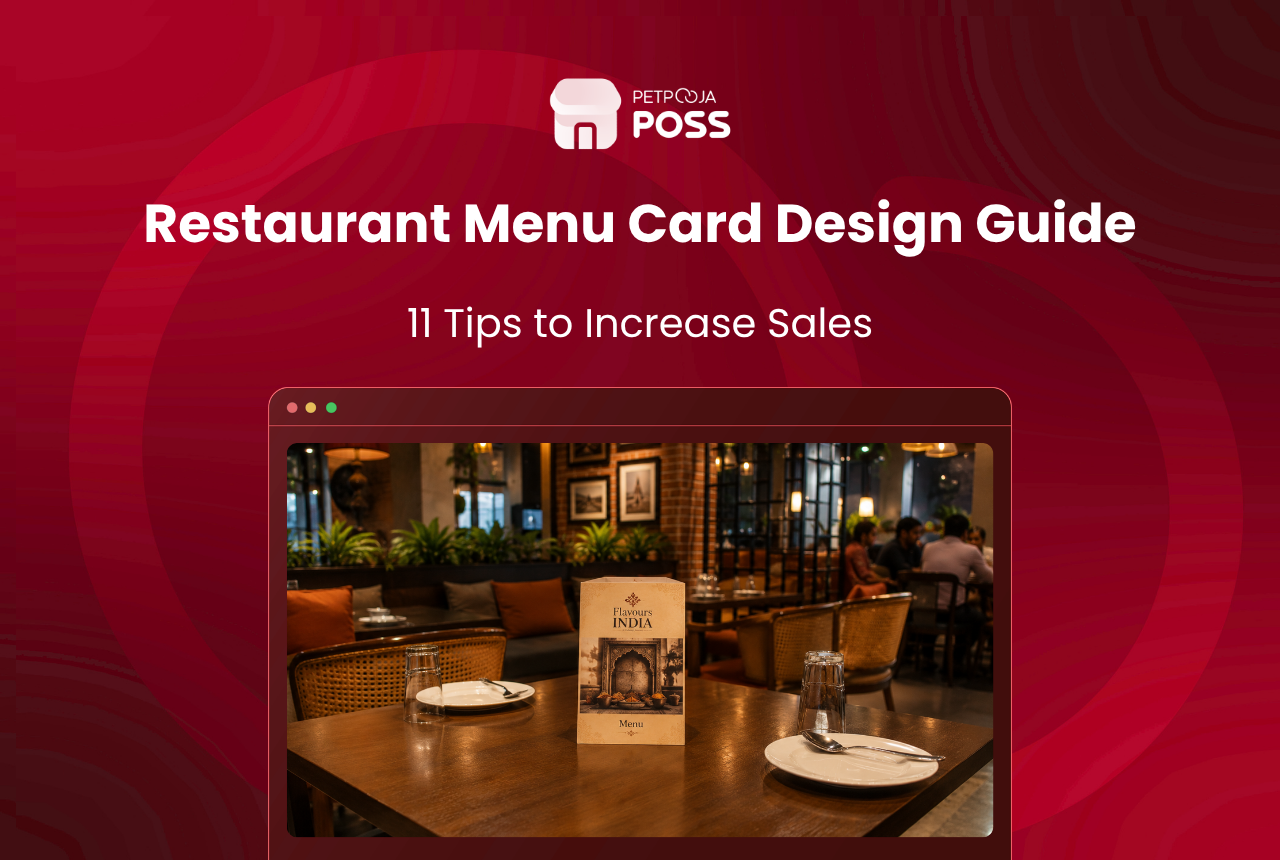
A menu card is the only sales tool a guest holds for a whole meal. In most restaurants a printer designed it, not the owner, and it quietly works against the dishes you most want to sell.
Restaurant menu card design is not really about better artwork. You decide which dishes you want ordered. Then you take away everything on the page that blocks that order. Layout, price format, wording and the lines Indian law asks for all follow from that decision.
Across the outlets running on Petpooja POSS, the sales report tells the same story: a small group of dishes carries the outlet. Some of the advice on fixing that is out of date. The best known idea of all, the golden triangle, did not survive eye-tracking research, and we cover what replaced it below.
Key Takeaways
- Start from your sales report, not a design brief.
- Guests read a menu in order, like a book, not in a “sweet spot”.
- Plain numbers with no rupee sign are linked to higher spend.
- A right-hand price column invites cheapest-first ordering.
- Plan the FSSAI veg, non-veg and allergen marks before you print.
Why Menu Card Design Changes What Guests Order
A guest scans the card, decides, and rarely reads all of it. Whatever stands out on that pass becomes the shortlist. The rest of the menu may as well not exist, which is why two outlets with identical food can post very different average bills.
The card also sets expectations about price before a single dish arrives. Older work on menu psychology covers the emotional side well. The rules below stay practical: what to change on the page, and how to tell whether it worked.
11 Restaurant Menu Card Design Rules That Lift Orders
Each rule stands on its own. Apply two this month and the rest at your next reprint.
1. Begin With the Sales Report, Not the Design Brief
Before anyone opens a design file, pull the last 90 days of item-wise sales. Your POS sales report already ranks every dish by units sold and by revenue. That ranking is the real brief.
Mark the ten dishes you most want to sell more of. Those ten get prime space, a description and clean surrounding air. Everything else on the card exists to make them easy to find.
2. Cut the Item Count Until Every Dish Earns Its Place
A long menu feels generous and costs you twice, once in wasted stock and once in guest attention. Work out each dish’s menu mix percentage, which is its share of total plates sold.
Anything under about one per cent of plates over a full quarter is a candidate to go. Take a cafe in Aundh, Pune, that cut 14 slow items (an example). Ticket times in the evening rush fell, and the fridge stopped carrying stock for dishes nobody ordered.
3. Position by Reading Order, Not the Golden Triangle
Most menu advice still repeats an idea from 1978, that guest eyes jump to a sweet spot just above the middle of the right-hand page. Eye-tracking research by Sybil Yang tested it. Guests read a menu in order, left to right and down the page, much as they read a book.
So the strongest position is not a hot spot. It is first in its category, where the eye lands anyway. The same study found guests make two passes: they look hardest at mains first, then at the other sections. So every section needs a strong opening dish.
4. Strip the Rupee Sign and the Decimals
Write 240, not ₹240.00. Cornell researchers tested three price formats on 201 diners in a working restaurant. Guests spent about eight per cent more per cheque on the menu showing prices without a currency symbol, while writing the price out in words changed nothing.
That study was run in the United States. Treat the figure as directional, not a promise for an outlet in Madhapur. The mechanism still travels: a currency symbol reads as a cost, a bare number as part of the dish.
5. Kill the Price Column
A neat column of right-aligned prices with dotted leaders makes the card easy to scan by price alone. The guest then compares numbers instead of dishes, and that is the wrong first comparison.
Set the price right after the description instead, in the same size and weight as the body text. The reader now has to read the dish to reach the number.
Here are the same two dishes in both layouts (an example). A price column reads “Paneer Tikka ……… 320”. Run-in reads “Paneer Tikka, charcoal-grilled, pudina chutney 320”.
6. Write Descriptions That Say Something Specific
“Delicious, mouth-watering paneer tikka” tells a guest nothing they had not already guessed. “Charcoal-grilled hung-curd paneer, ajwain, served with pudina chutney” tells them what lands on the table.
Write descriptions for the ten dishes from Rule 1 and leave the rest bare. Our guide to writing menu descriptions goes deeper on wording. The test is simple: if the line would fit any restaurant in India, write it again.
7. Name Sections the Way Guests Name Them
Clever category names cost you orders. “From the Tandoor” works because guests already know the oven it names. “Chef’s Reverie” and “The Beginning” send people hunting for the starters.
Sort the sections in eating order too: starters, mains, breads and rice, desserts, drinks. A guest who cannot find the breads page will order fewer of them.
Keep each label to two or three words so it fits one line on paper and on a phone. “Tandoori”, “Curries” and “Kebabs” need no explaining to anyone.
8. Put One Premium Anchor in Each Section
Every section should hold one dish priced clearly above the rest. A ₹640 platter sitting next to mains at ₹320 to ₹390 makes those mains read as reasonable (an example), and some guests order the platter anyway.
This is where the card meets your margins. Pair the anchor with a high-margin dish placed right below it, using the same menu engineering logic you would apply to any pricing decision. Keep the anchor honest: it has to be a dish you are proud to serve, not a fake price used as bait.
9. Use White Space to Lead, and Box Only One Dish
Boxes, tints and borders work because they are rare. A card with six boxed dishes has no highlighted dish at all, only a busy page.
Allow one box per page at most, and put air around the dishes you want noticed. Empty space is not wasted space on a menu. It is the cheapest way you have to point at something.
Because guests read down the page in order, a break in the rhythm is what makes the eye stop. That is the work white space does. Test it by holding the card at arm’s length and squinting: whatever still stands out is what your layout is really selling.
10. Design for Your Dining Room’s Light, Not Your Laptop Screen
Body text below 10pt fails in a low-lit dining room, and grey type on cream card stock fails almost everywhere. Owners approve menus on a bright screen and then wonder why guests keep asking staff to read out the specials.
Print one proof, take it to a corner table at 8:30pm on a Saturday, and read it. If you reach for your phone torch, the type is too small or the contrast is too low.
11. Print Everything the Law Asks For
Compliance shapes the layout, so bring it in before the design is locked. Squeezing symbols in afterwards is what ruins a good page.
FSSAI’s Labelling and Display Regulations, 2020 have applied to food service establishments since 1 January 2022. Here is what belongs on the card.
| What Your Menu Card Must Show | Which Restaurants It Applies To |
|---|---|
| Green veg symbol or brown non-veg symbol against each dish | Food service establishments, on menu cards and boards |
| Allergen information for each dish, in text or as symbols | Food service establishments, on menu cards and boards |
| Calorie value per serving, plus the serving size | Central FSSAI licence holders, or brands with 10 or more outlets |
| The 2,000 kcal average daily requirement disclaimer | Central FSSAI licence holders, or brands with 10 or more outlets |
The second rule concerns charges. The CCPA barred restaurants from adding a service charge by default on 4 July 2022, and the Delhi High Court upheld that position on 28 March 2025.
Guests have to be told plainly that the charge is voluntary, so word it that way on the card. Our restaurant bill format template shows how the same information sits on the bill.
How to Check Whether Your New Menu Card Worked
A new card is a change you can measure, and one week of data is usually enough to see the direction.
- Note the average bill value and the units sold for your ten target dishes for the 30 days before the change.
- Print the new card and change nothing else, no new offer and no new staff script, for two full weeks.
- Compare the same two numbers for the first 14 days after the switch.
- Look at each target dish separately, because a flat average bill can still hide one dish that doubled.
The comparison is only as good as your item-level data. A restaurant POS records every KOT by item, so the before-and-after view is a report rather than a counting exercise. Track a QR or digital menu as a separate card, because a phone screen needs its own order of dishes.
Conclusion
Menu card design pays off because it changes what guests order without changing what you cook. Start with the sales report, cut the dead items, respect reading order, and get the FSSAI lines right the first time.
You do not need all 11 rules at once. Pick the three that apply worst to your current card and test them for a fortnight. When item-level sales data is quick to pull, that test takes minutes, and Petpooja POSS gives you the view across every outlet.
Frequently Asked Questions
Plan a reprint twice a year. A price sticker on a laminated card means you are already overdue. Keep anything that dates quickly off the main card, such as festival offers, and put those on a separate insert. Settle your menu pricing strategy before a print run, not after it.
Both are common in India. Most restaurants print pre-tax prices and add GST on the bill. Whichever you choose, say so in one line on the card. A guest who reads 240 and pays 252 feels misled even when the billing is correct. A free menu pricing calculator helps you set the number first.
Yes. A printed card is read across two facing pages, while a phone shows a narrow single column. Rebuild the order of items for that column, keep category names short enough for a phone header, and drop the page furniture that only makes sense on paper.
Size follows the table, not the printer’s standard sheet. Measure the free space on your smallest two-seater once cutlery and a water bottle are on it, then stay inside that. A card a guest has to hold up in the air gets scanned quickly and put back down.